- Skip Ahead to
- How to navigate to Analytics available in SHYFT Flexview’s power dashboard
- Analytics available in SHYFT Flexview’s power dashboard
- Meters tree view
- Disaggregate Meter data checkbox
- Time Range dropdown
- Time Range Calendar
- Compared to dropdown
- Group time dropdown
- Primary Axis dropdown
- Chart Type dropdown (Primary Axis)
- Cumulative checkbox (Primary Axis)
- Secondary Axis Dropdown
- Chart Type dropdown (Secondary Axis)
- Cumulative checkbox (Secondary Axis)
How to navigate to Analytics available in SHYFT Flexview’s power dashboard
Please follow the below steps to navigate to Analytics in SHYFT Flexview’s power dashboard:
Here is what you can do in Resident User Management dashboard:
- On your browser window please open the url : https://flexview.shyftpower.com/
- It will open the login screen as shown in the below screenshot:

- Enter your login email and password for SHYFT Flexview Power dashboard.
- On the login screen you also get the option to sign in using your Google login.
- After login you will be redirected to the SHYFT Flexview Power dashboard as shown in the below screenshot.
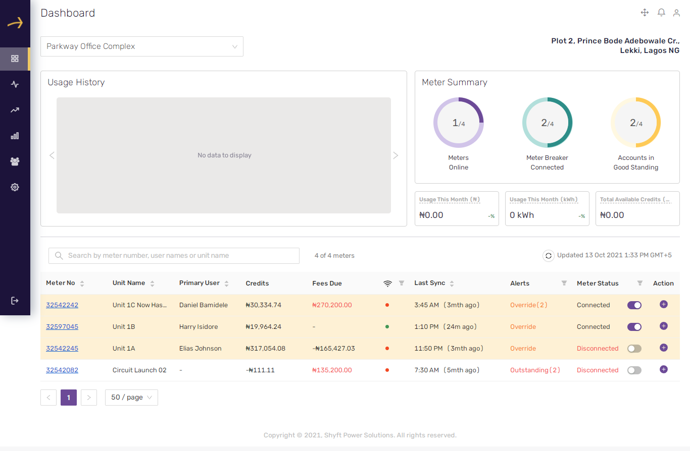
- From the left side panel, please click on the “Analysis” menu item as shown in the below screenshot:
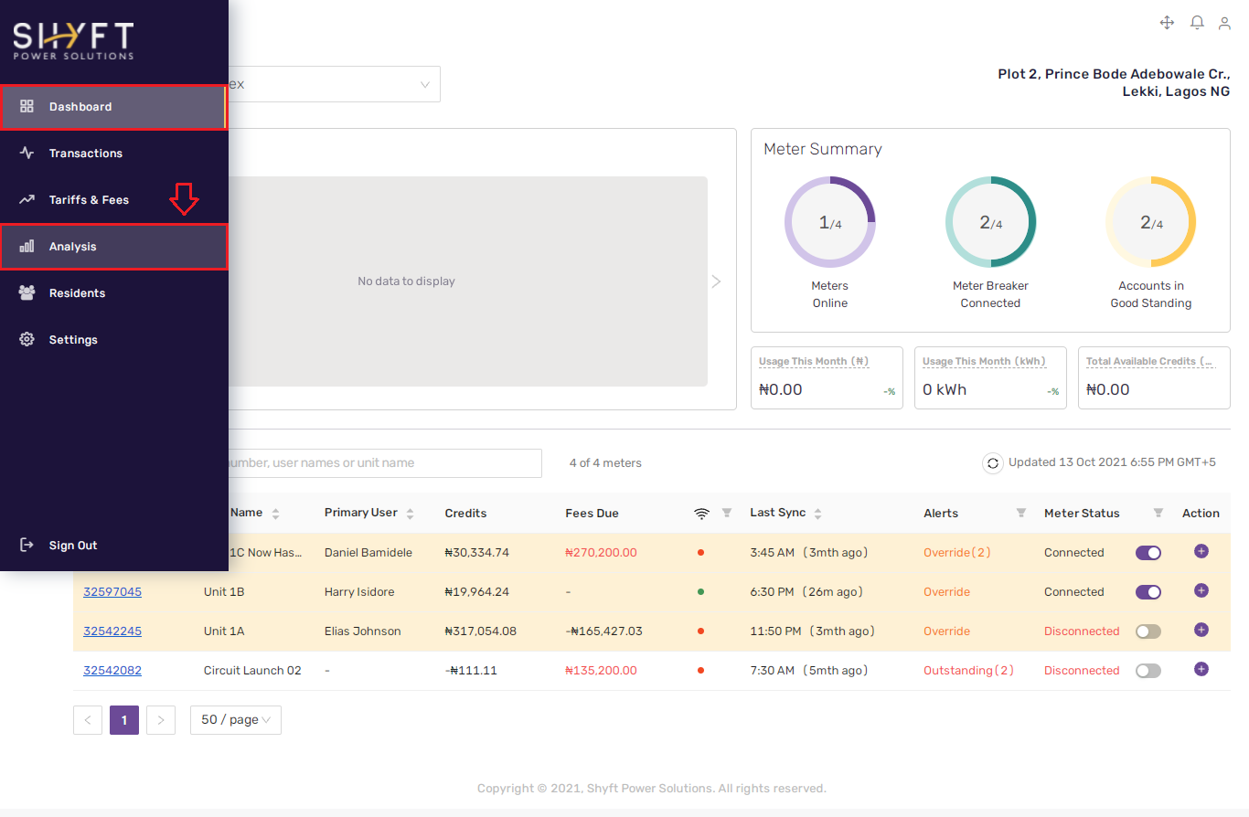
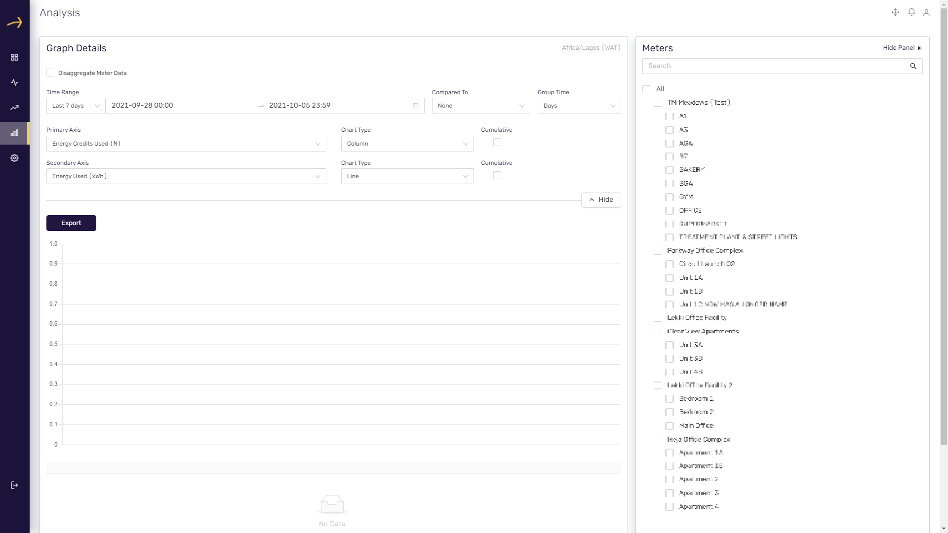
- Clicking on the “Analysis” menu item will open the analytics dashboard as shown in the below screenshot:
Analytics available in SHYFT Flexview’s power dashboard
On the SHYFT Flexview’s power dashboard, you can see the analytics for the energy consumption, energy credits used, voltage and current for selected property unit meters over a period of time. You can see the report with different chart styles grouped by 15 minutes, hours, days, weeks and months.
To view the analytics you need to navigate to the Analysis dashboard. Please check this article on how you can navigate to the Analysis dashboard

You can see that the chart will not display any data by default. You need to select the respective property unit meters from the meters treeview available on the right side and select the required time range. Explained below are the various parts of the analysis dashboard:
Meters tree view
On the right side of the analysis dashboard you can see a tree view titled as meters. You need to select the meters from the tree view respective to the property units which you would like to analyse in the chart report. You can select multiple meters at once. You can also see a search box available on the top of the meters tree view. You can search for property unit meters by entering their names in the search box provided.
Please check the related screenshot below:
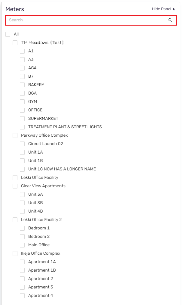
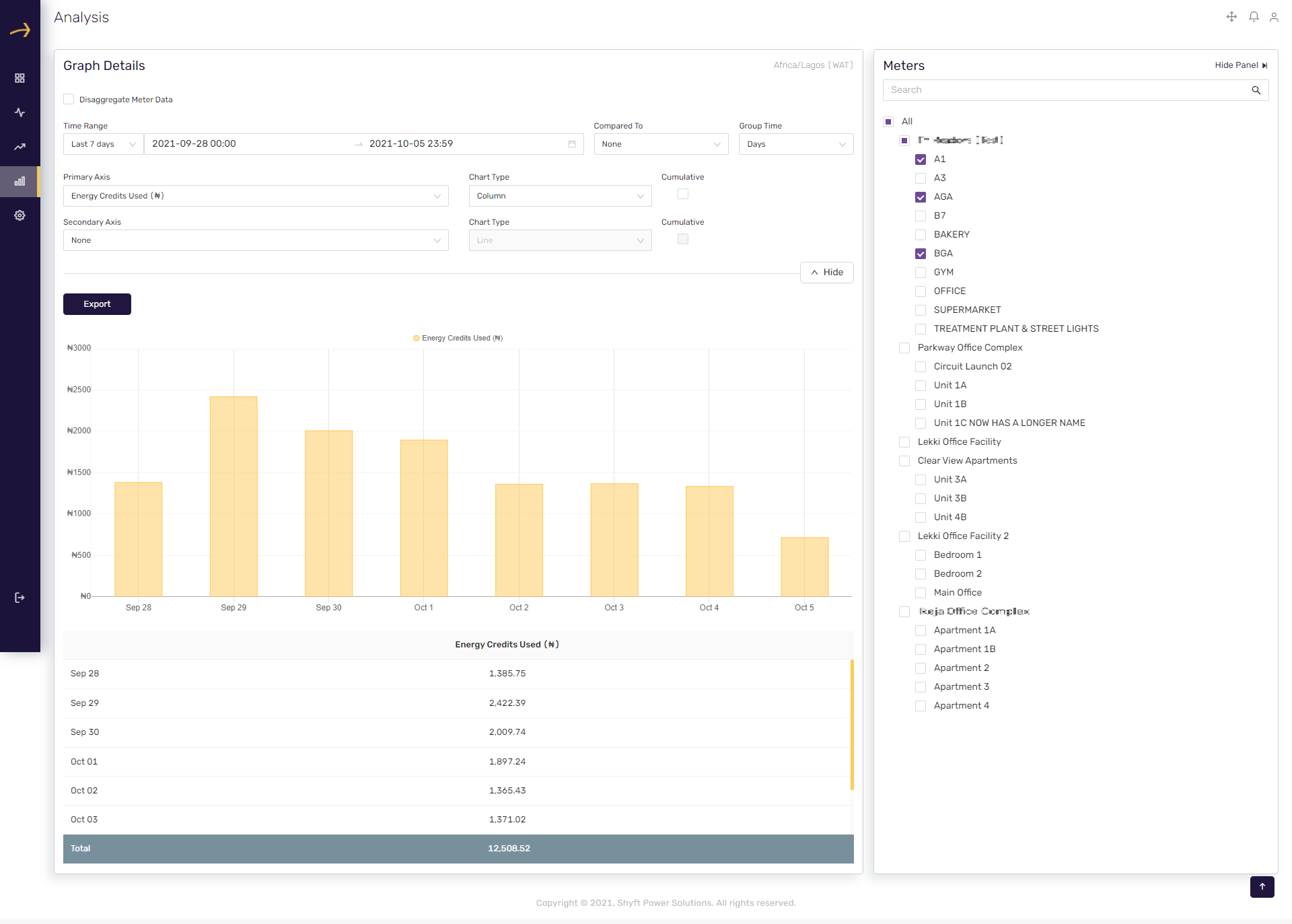
After unit meter(s) selection you will be able to see the chart report respective to the selected meters. Please check the related screenshot below:
Disaggregate Meter data checkbox
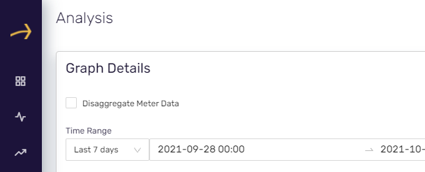
This is a checkbox available on the top of the analysis dashboard as shown in the below screenshot.
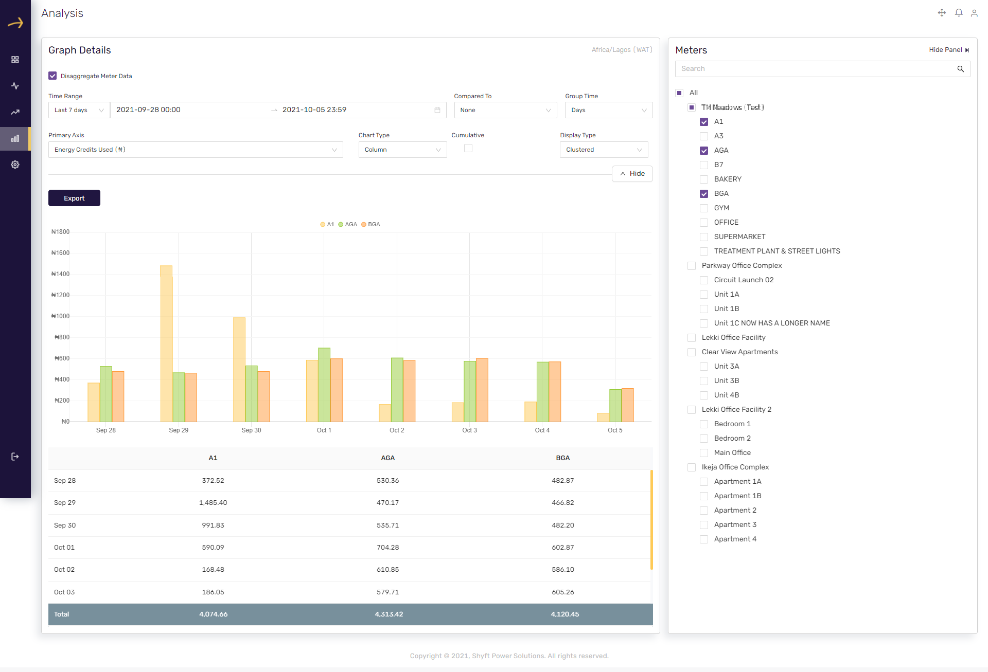
When you check this checkbox the report is disaggregated for individual unit meters as shown in the below screenshot:
Time Range dropdown
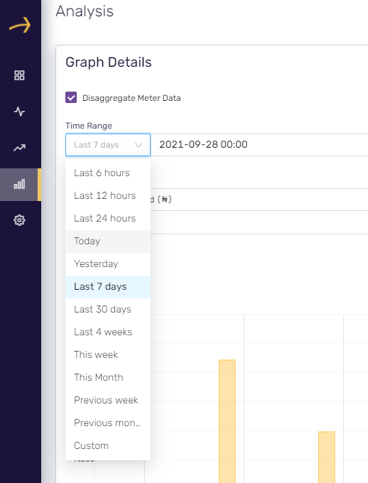
You can select the time range from the last 6 hours till the previous month or select the “custom” option to manually select the date range available in the calendar provided next to it.
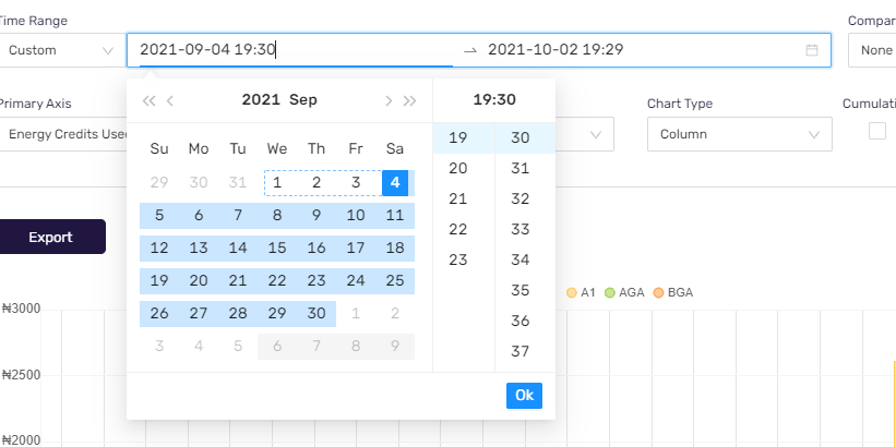
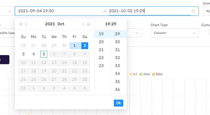
Time Range Calendar
Using this you can select the date range (From date and To date) manually to view the report. Please check the related screenshots below:
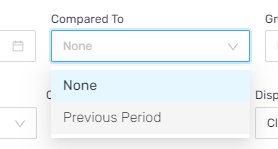
Compared to dropdown
Using this you can compare the current report data with the previous period. Please select the “Previous Period” option to do so. Please check the related screenshot below:
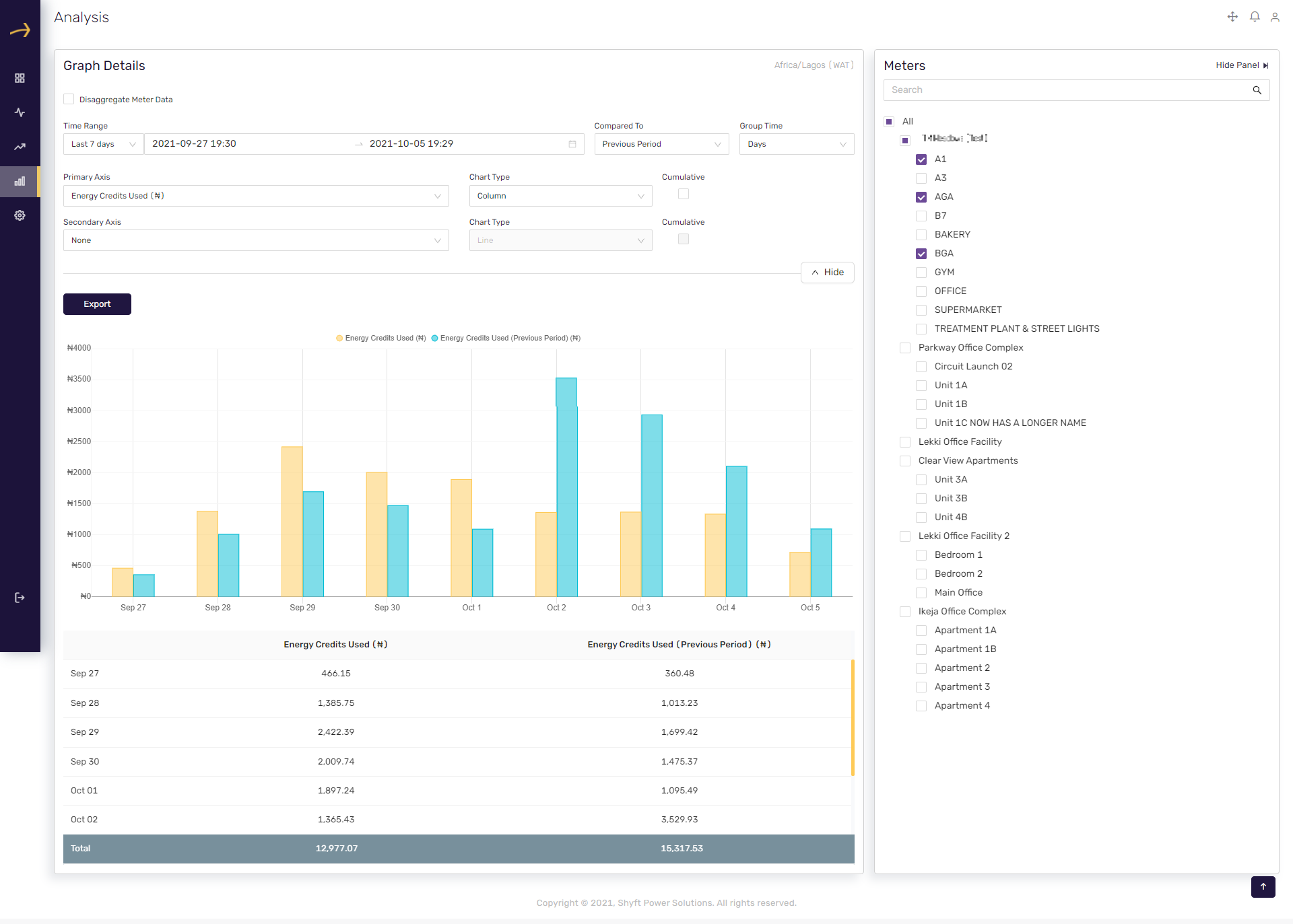
When you select “Previous Period” option the report will show comparison with the previous period data as shown in the below screenshot:
Group time dropdown
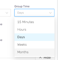
You can select the duration on which you would like to group the report data. You can select from 15 minutes to Months.
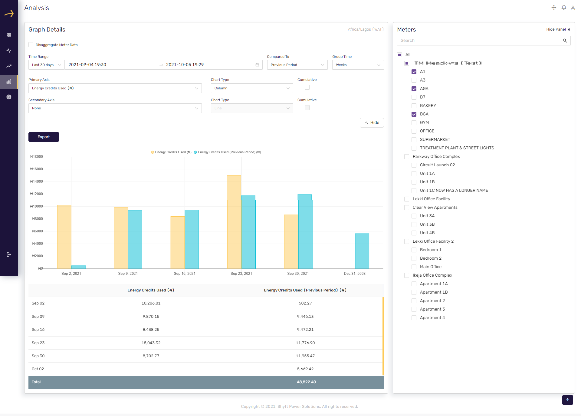
Selecting an option from the group dropdown will group the report data based on the selected duration. Please check the related report screenshot below where we have selected the “Weeks” option:
Primary Axis dropdown
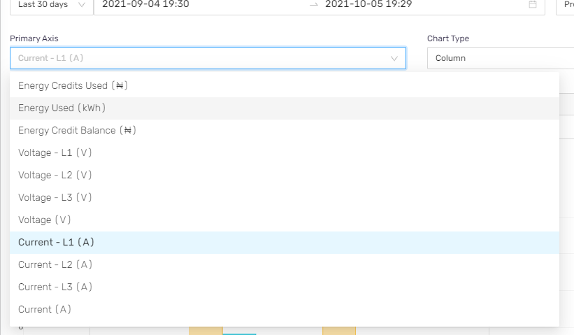
Here you can select the parameter for the primary axis for which you would like to see the reporting. You can select Energy credits, Energy units consumed, Energy credit balance, Voltage and Current. Please check the related screenshot below:
The report will display the data respective to the parameter selected in the “Primary Axis” dropdown. Please check the below report screenshot where we have selected Energy Used(kWh) in the primary axis dropdown:
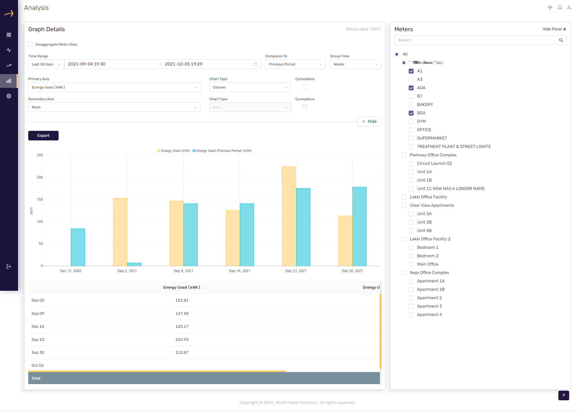
Chart Type dropdown (Primary Axis)
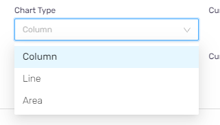
Here you can select the type of the chart for the primary axis. It can be a column, line or area.
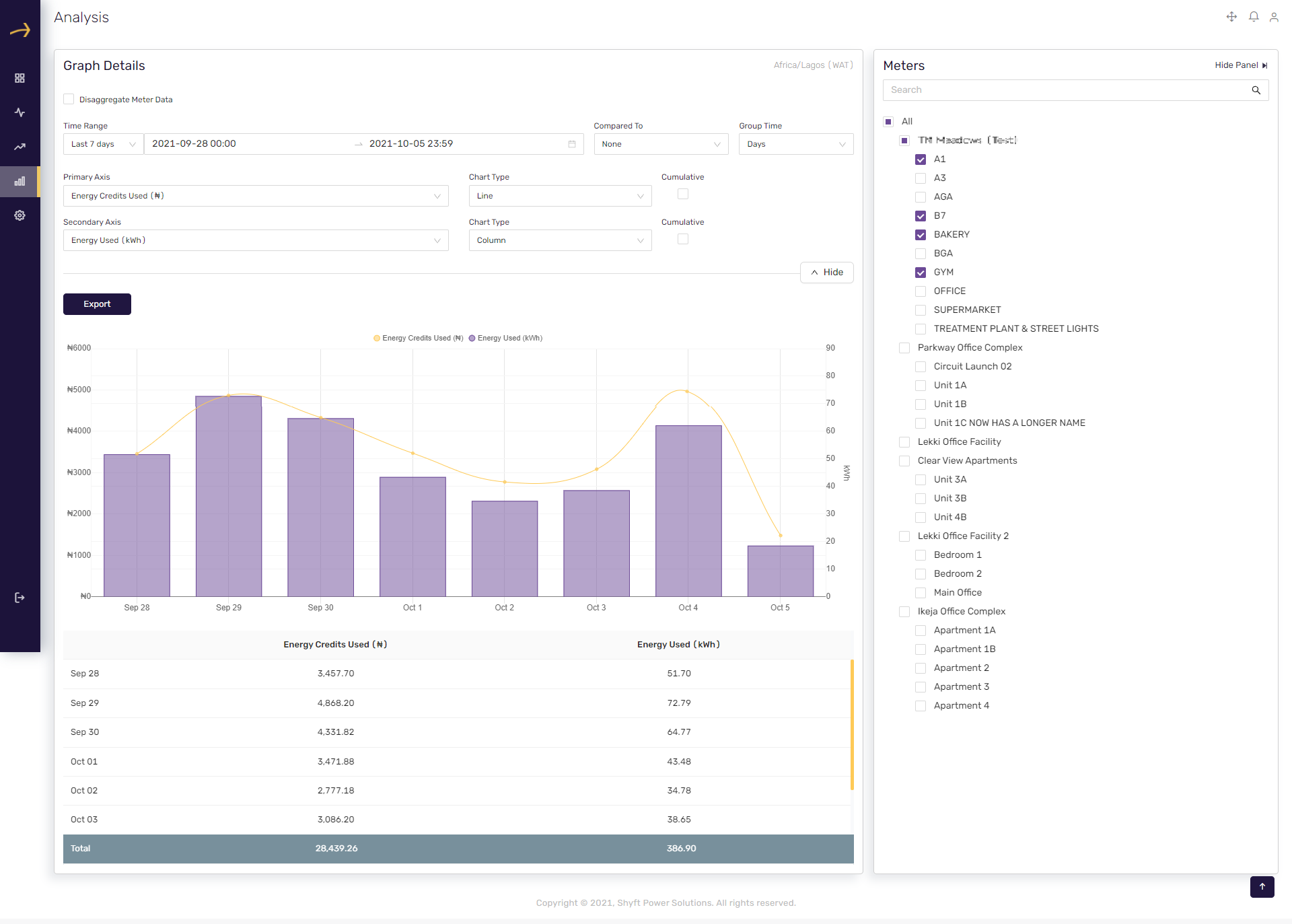
Please check the below screenshot where we have selected Line in the chart type for primary axis:
Cumulative checkbox (Primary Axis)
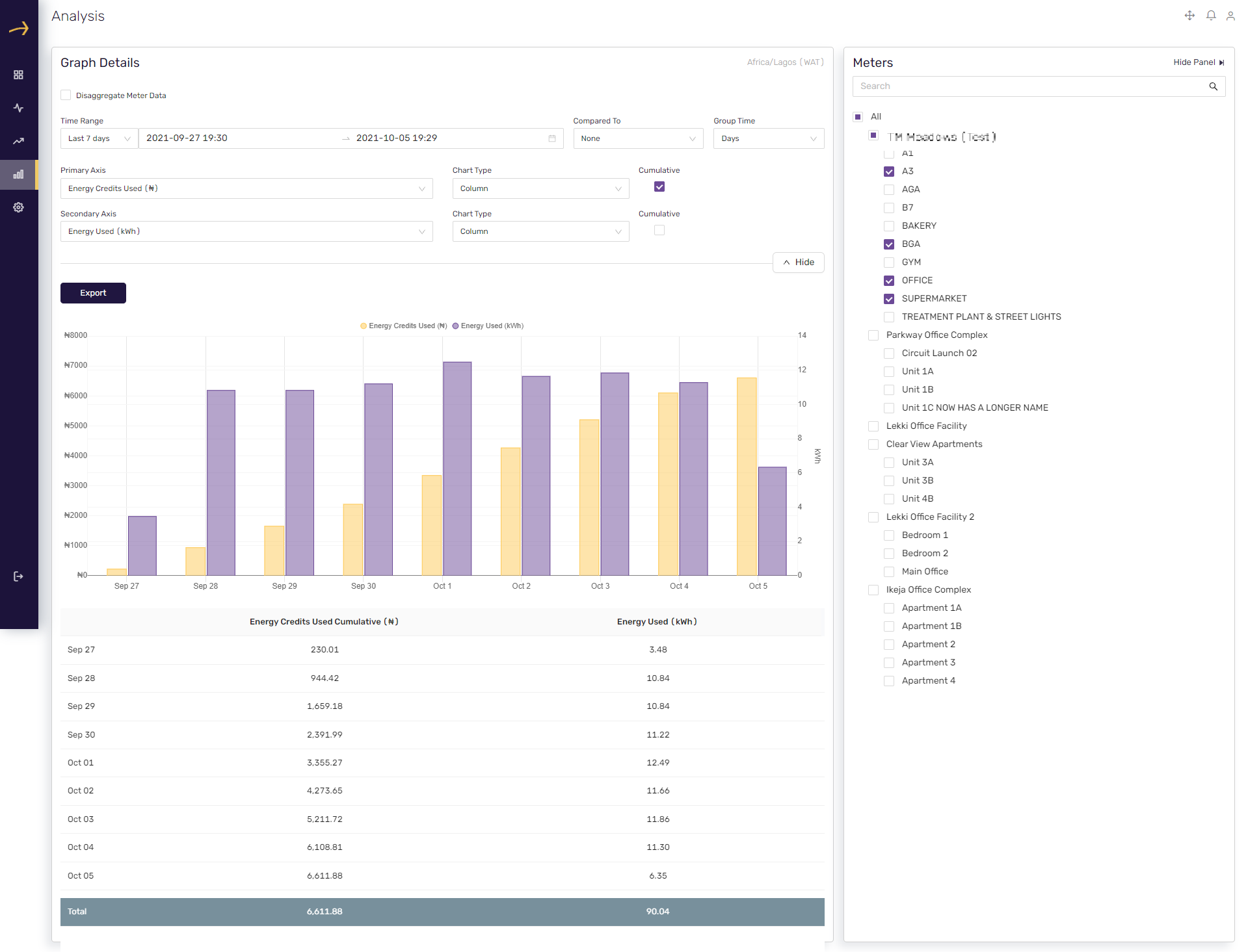
This checkbox shows data in a cumulative way on the table below the chart for primary axist.

Please check the related screenshot below where we have checked the cumulative checkbox for the primary axis.
Secondary Axis Dropdown
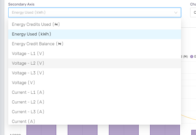
Here you can select the parameter for the secondary axis for which you would like to see the reporting. You can select Energy credits, Energy units consumed, Energy credit balance, Voltage and Current. Please check the related screenshot below:
The report will display the data respective to the parameter selected in the “Secondary Axis” dropdown. Please check the below report screenshot where we have selected Voltage -L1(V) in the primary axis dropdown:
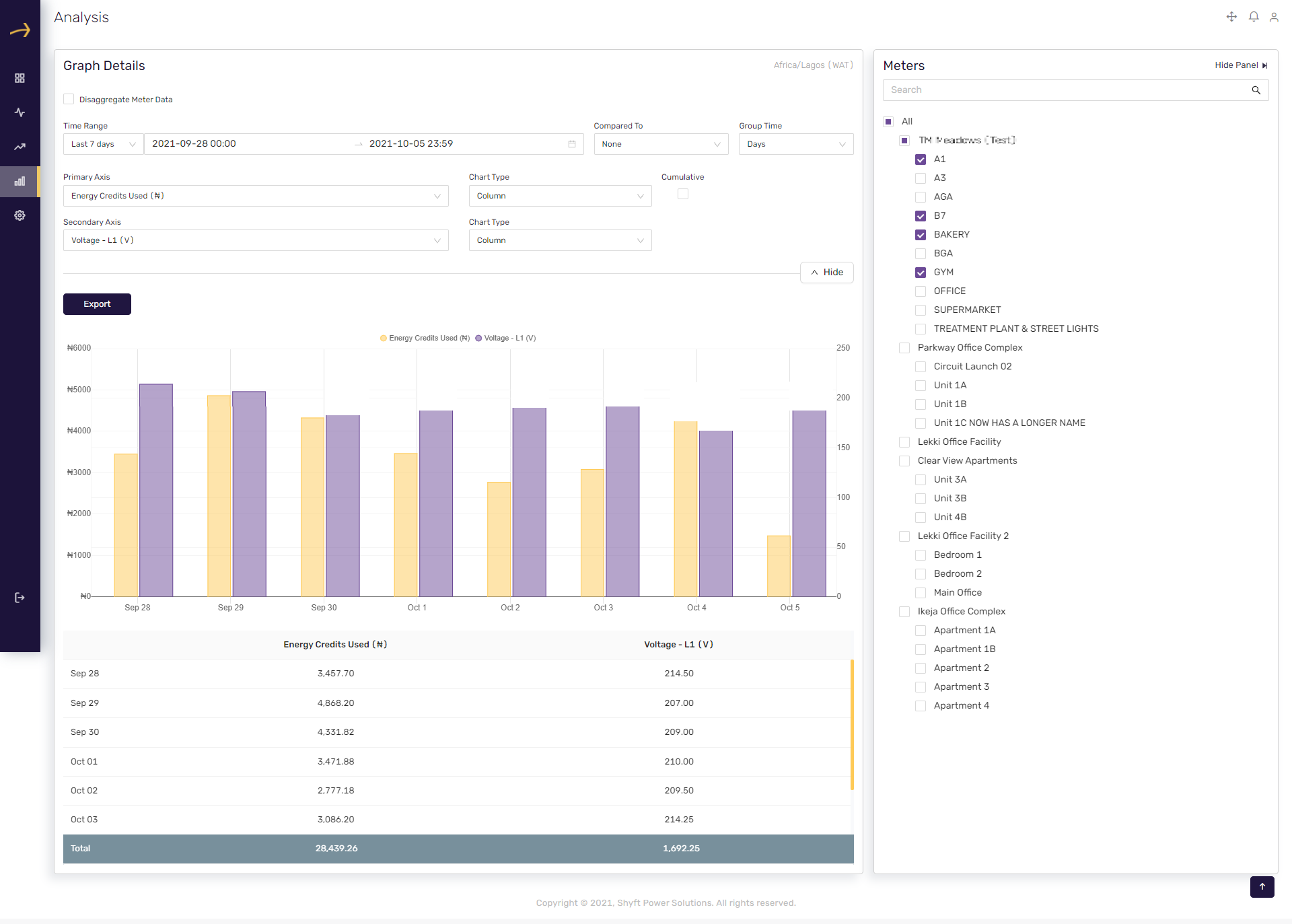
Chart Type dropdown (Secondary Axis)
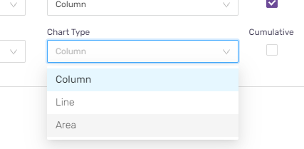
Here you can select the parameter for the secondary axis for which you would like to see the reporting. You can select Energy credits, Energy units consumed, Energy credit balance, Voltage and Current. Please check the related screenshot below:
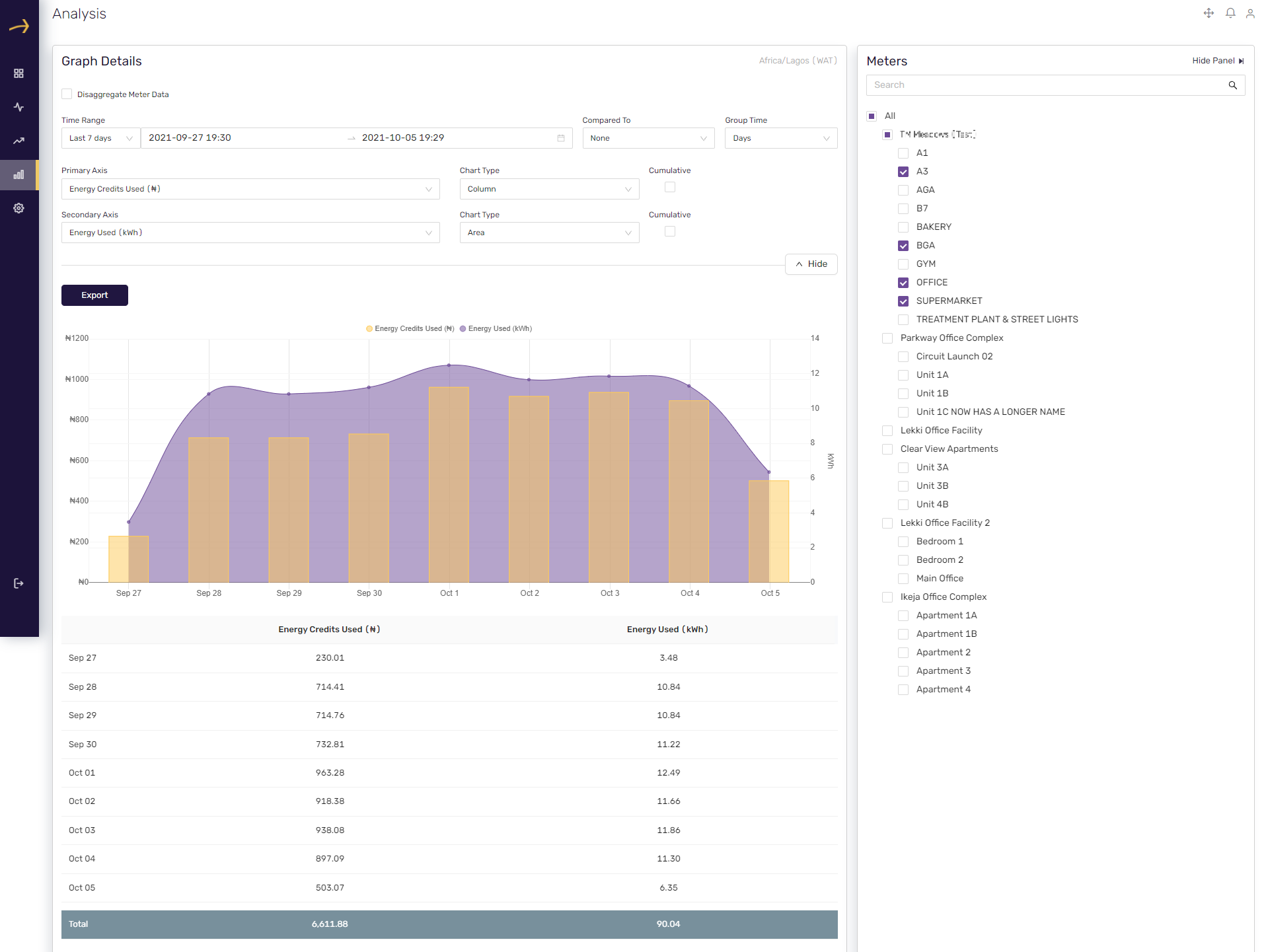
Please check the below screenshot where we have selected “Area” in the chart type for secondary axis:
Cumulative checkbox (Secondary Axis)
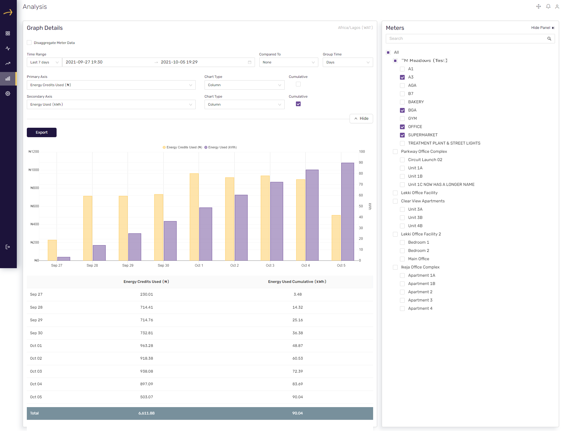
This checkbox shows data in a cumulative way on the table below the chart for the secondary axis.

Please check the related screenshot below where we have checked the cumulative checkbox for the secondary axis.
Comments
Please sign in to leave a comment.