In the SHYFT Connect App, you can analyze a single site as well as compare multiple sites based on various measures like Cost, Savings, Energy Production, Run time, Fuel Level, Fuel consumption, Battery state of charge, CO2 emission, Voltage etc in a date range. Below is the detailed explanation of both of the analytical reports.
Analyze a single site
This report shows the graphical representation of the daily variation of one or multiple measures for a single site within the selected date range. To analyse a single site take the following steps:
- Login to the SHYFT Power application.
- Click on the Analysis menu item from the left side bar. It will open two more sub-menu items: “Analyze” and “Compare”.
- Click on the “Analyze” sub-menu item from the left side bar. Please check the related screenshot below:

- It will open a new window as shown in the below screenshot:
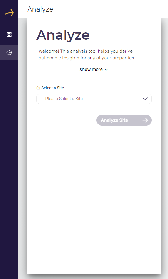
- Select a site from the provided dropdown and click on the button named “Analyze Site”. This will open the next page in the wizard. Please check the below screenshot:
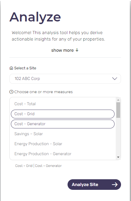
- Select one or more measures for the selected site to analyze and click on the “Analyze Site” button. For example in this example we have selected Cost-Grid and Cost-Generator as two measures to analyze for the selected site.
- It will open the report as shown in the below screenshot. This report is displaying daily estimated cost in user’s currency for both of our selected measures Cost-Grid and Cost-Generator.
- You can also see the tabular format of the report below the graphical format. The tabular report shows the estimated data for all of the selected measures for every 15 minutes of time slots.
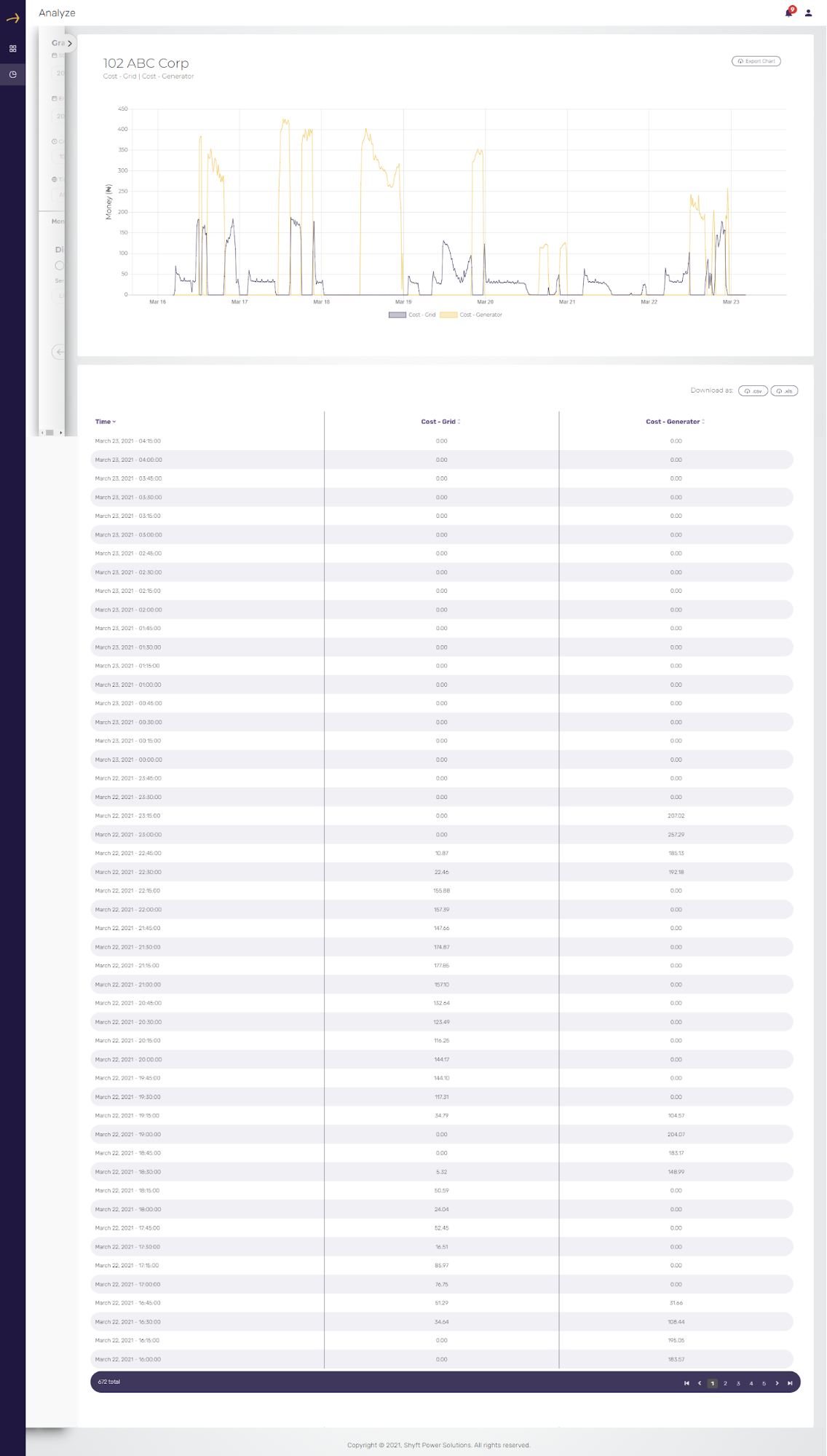
- You can change the filters and display format of the report by clicking on the arrow from the left side window which is partially visible. Please check the related screenshot below:
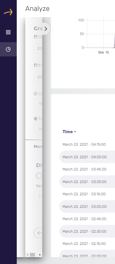
- The above action will bring up the full window as shown in the below screenshot:
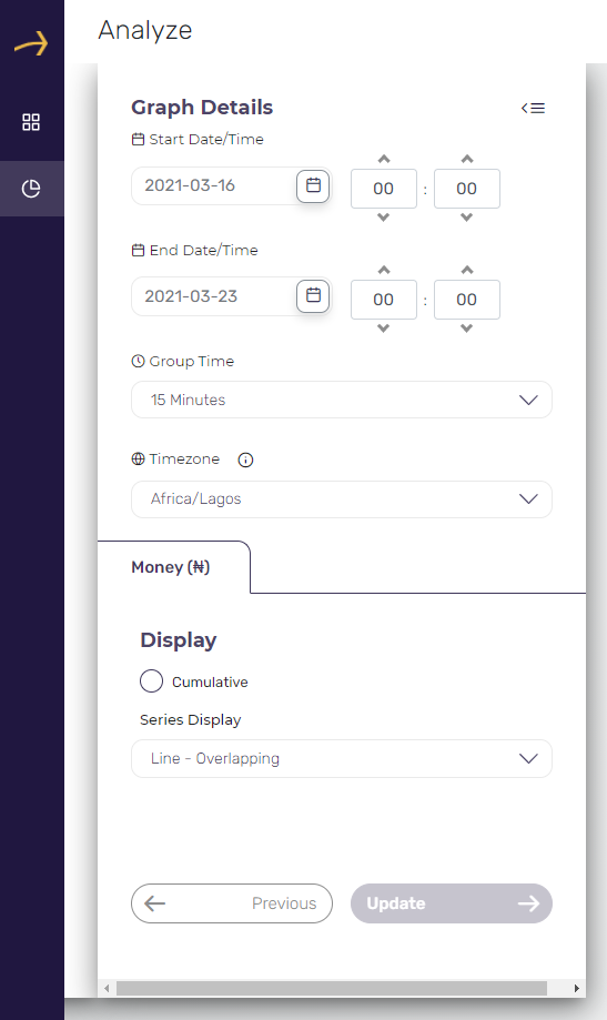
- You can change the date range and time period in which you would like to see the report.
- You can change the group time to 15 minutes, 1 hour, and 1 day as per your requirement. It will display the data in the report according to the selected slot of time.
- You can also select your preferred time zone from the provided dropdown. The date and time in the report will be displayed as per the selection made here.
- You can choose the report format to be Cumulative and select the series display format from one of the following formats:
14.1. Line - Overlapping
14.2. Line - Stacked
14.3 Area - Overlapping
14.4 Area - Stacked
14.5 Bar - Grouped
14.6 Bar - Stacked
Please check the related screenshot below.

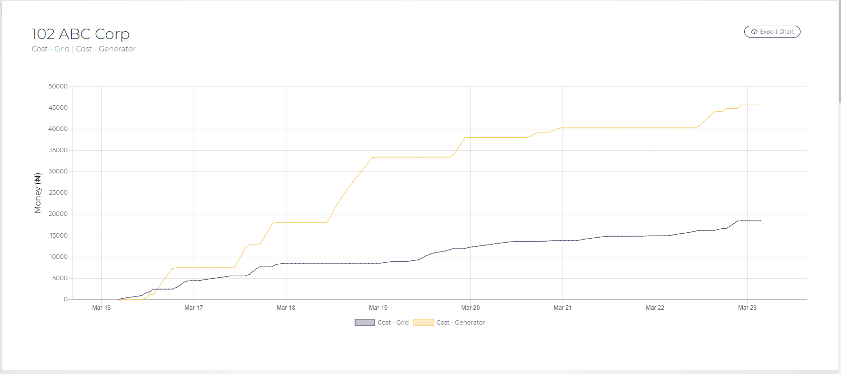
Please check the below screenshot for cumulative Line-overlapping report format:
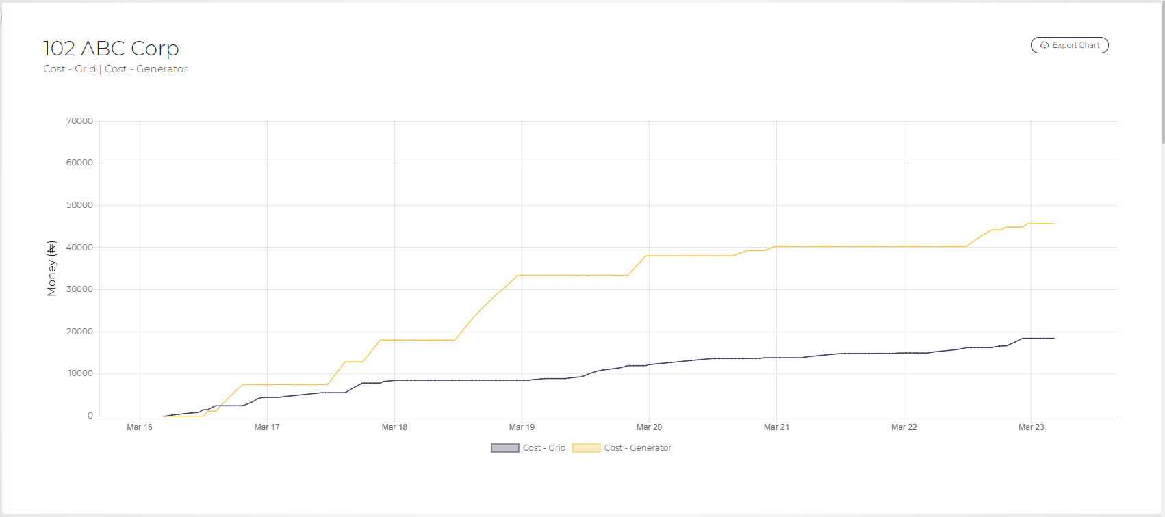
Please check the below screenshot for cumulative Line - Stacked report format:
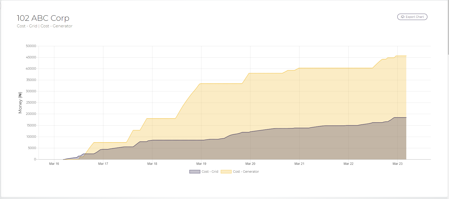
Please check the below screenshot for cumulative Area - Overlapping report format:
Please check the below screenshot for cumulative Area - Stacked report format:
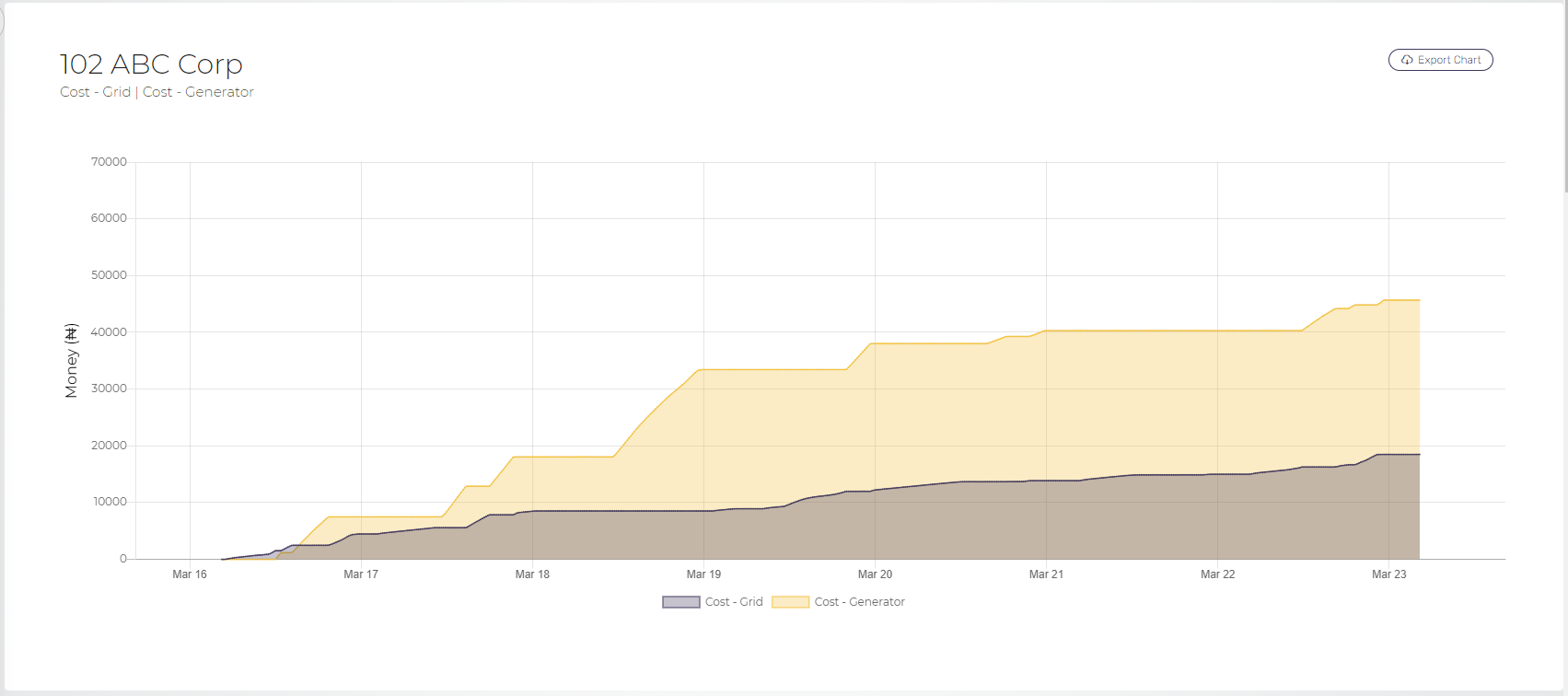
Please check the below screenshot for cumulative Bar - Grouped report format:
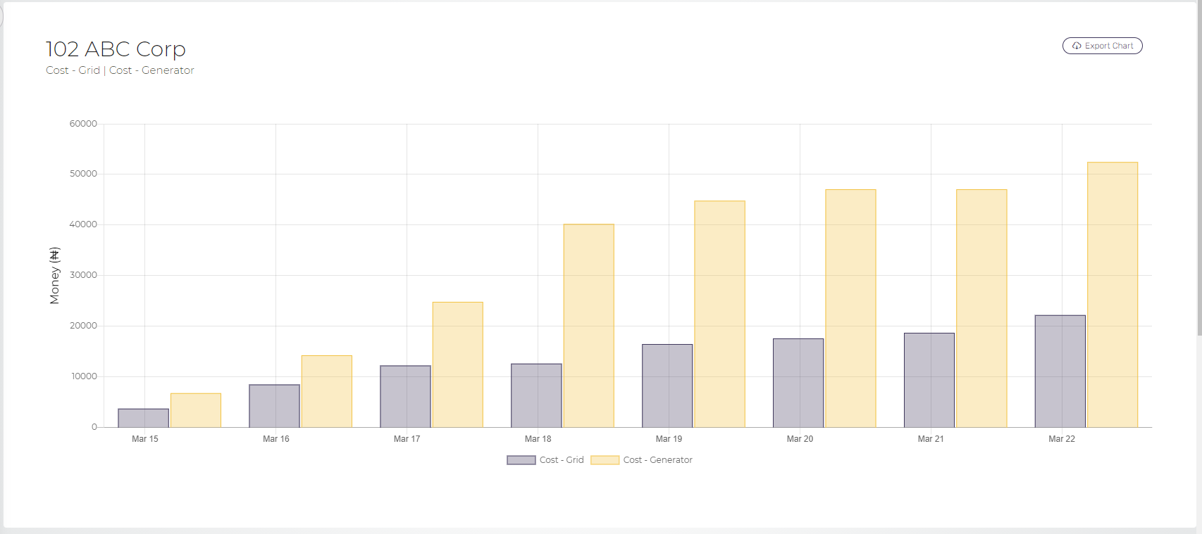
Please check the below screenshot for cumulative Bar - Stacked report format:
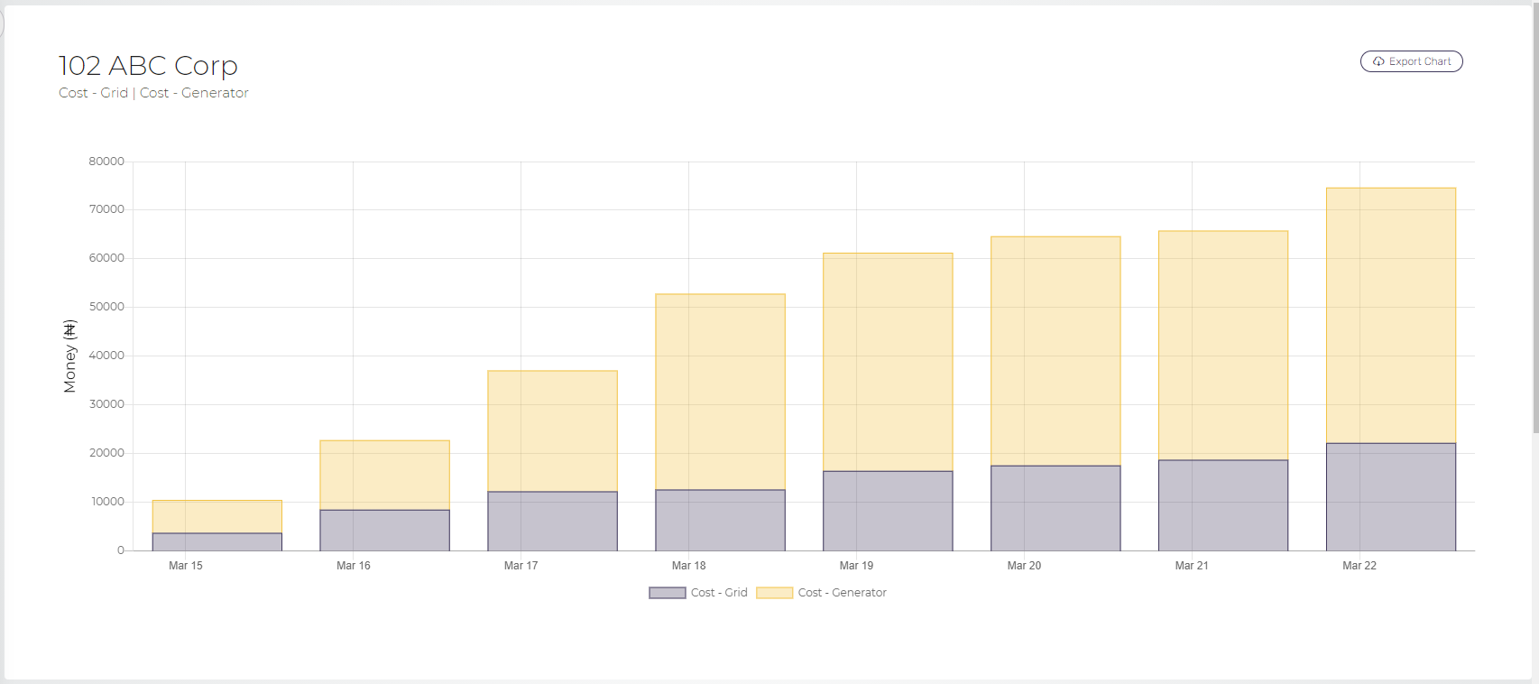
Compare multiple sites
This report shows the graphical representation of the daily variation of one measure for two or more sites within the selected date range. To compare multiple sites take the following steps:
- Login to the SHYFT Power application.
- Click on the Analysis menu item from the left sidebar. It will open two more sub-menu items: “Analyze” and “Compare”.
- Click on the “Compare” sub-menu item from the left sidebar. Please check the related screenshot below:

- It will open a new window as shown in the below screenshot:
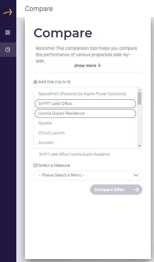
- Select sites up to 6 to compare from the provided list of sites.
- Select a measure to compare in the selected sites from the provided dropdown. You can compare the selected sites in any one of the following measures:
6.1. Cost - Total
6.2. Cost - Grid
6.3. Cost - Generator
6.4. Energy Production - Generator
6.5. Energy Production - Grid
6.6. Energy Production - Total
6.7. Run Time - Generator
6.8. Run Time - Grid
6.9. Run Time - Inverter
6.10. DownTime
6.11. Fuel level - Liters
6.12. Fuel level - %
6.13. Fuel consumption - Liters
6.14. Battery State of Charge
6.15. CO2 emission - Total
6.16. CO2 emission - Generator
6.17. CO2 emission - Grid
6.18. Voltage - Generator
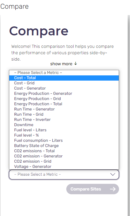
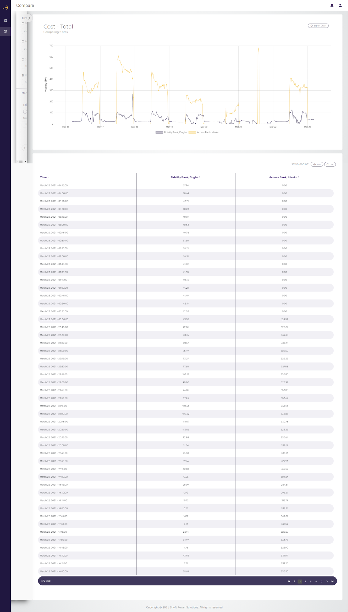
- Select a measure which you would like to compare for the selected systems and click on the “Compare Sites” button. In the below example we have selected Cost - Total.
- The above action will open the comparison report of the selected sites in graphical as well as tabular format. Please check the related screenshot below:
- You can change the filters and display format of the report by clicking on the arrow from the left side window which is partially visible. Please check the related screenshot below:

- The above action will bring up the full window as shown in the below screenshot:
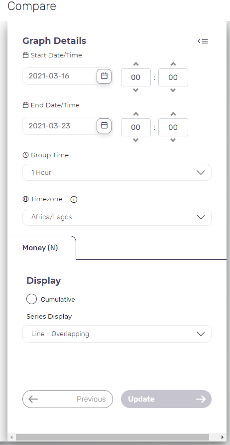
- You can change the date range and time period in which you would like to see the report.
- You can change the group time to 15 minutes, 1 hour and 1 day as per your requirement. It will display the data in the report according to the selected slot of time.
- You can also select your preferred time zone from the provided dropdown. The date and time in the report will be displayed as per the selection made here.
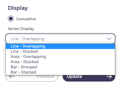
- You can choose the report format to be Cumulative and select the series display format from one of the following formats:
14.1. Line - Overlapping
14.2. Line - Stacked
14.3 Area - Overlapping
14.4 Area - Stacked
14.5 Bar - Grouped
14.6 Bar - Stacked
Please check the related screenshot below.
Please check the below screenshot for cumulative Line-overlapping report format:
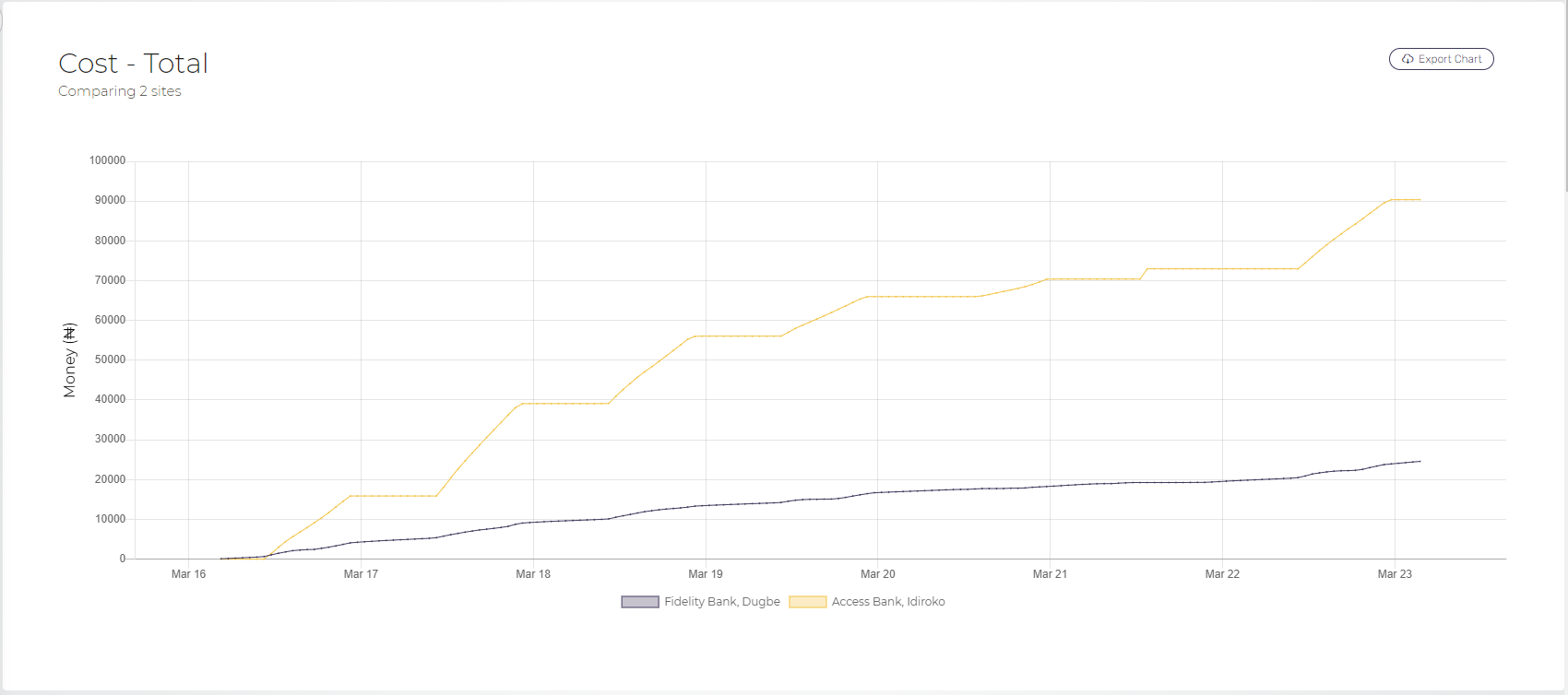
Please check the below screenshot for cumulative Line - stacked report format:
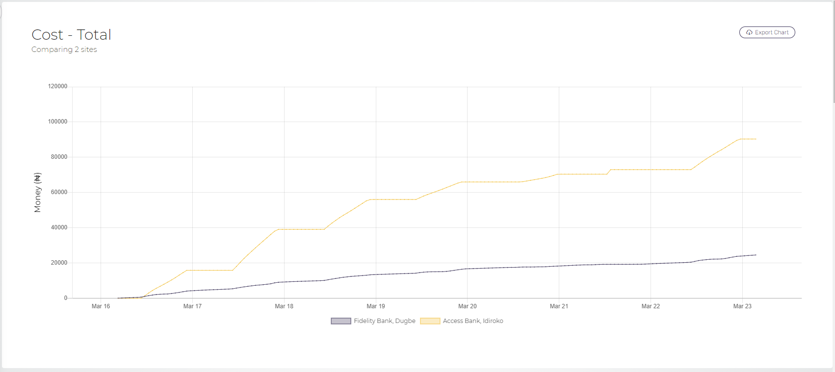
Please check the below screenshot for cumulative Area - overlapping report format:
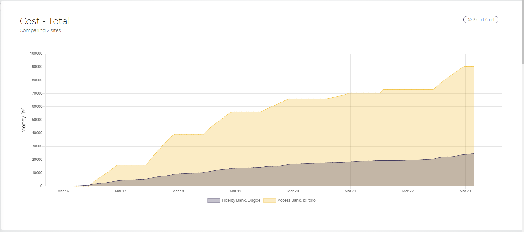
Please check the below screenshot for cumulative Area - stacked report format:
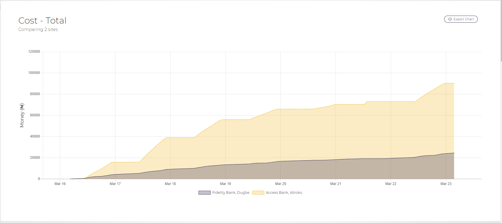
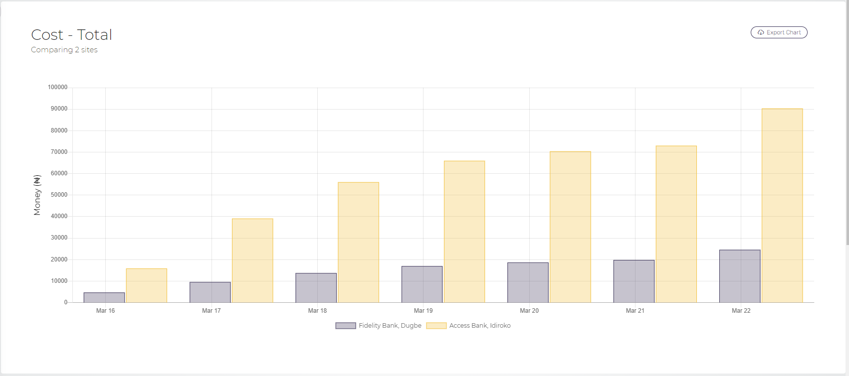
Please check the below screenshot for cumulative Bar - grouped report format:
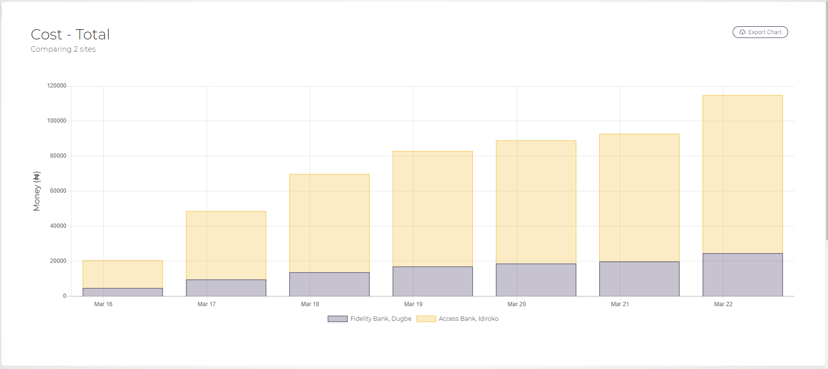
Please check the below screenshot for cumulative Bar - Stacked report format:
Comments
Please sign in to leave a comment.