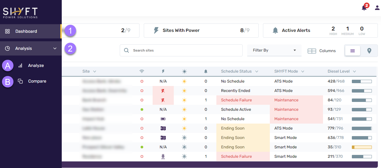
For navigation, through the SHYFT Power app, we have a side panel on the left.
Mouse-hovering on the left side panel opens it out. Please check the below screenshot. There are two menu items in the side panel: Dashboard and Analysis.

- Dashboard: Clicking on the Dashboard menu item opens up the SHYFT Power application’s dashboard. Please check this article that describes the dashboard.
- Analysis: Clicking on the Analysis menu item opens to sub-menu options: Analyze and Compare.
2(a). Analyze: Clicking on the Analyze sub-menu item opens the analytics report where you can analyze various metrics such as Cost, Energy, Run time, Downtime, CO2 emission, Voltage, etc for a single site. Please check this article that describes the Analyze feature in more detail.
2(b). Compare: Clicking on the Compare sub-menu item opens the analytics report where you can analyze and compare a single measure of multiple sites in a date range. You can compare up to 6 sites at a time. Please check this article that describes the Compare feature in more detail.
Comments
Please sign in to leave a comment.